How many times do you read an article online and think, “Wow, this is a beautiful font?” I do that a lot, but then again, I grew up in a graphic design studio and was obsessed with typography ever since I can remember.
The majority of readers don’t pick up the daily paper or read your website content because they are looking for aesthetic satisfaction. They want information. Information that will make their lives better, easier, more enjoyable, more successful.

Readability is everything. The single most important aspect of good typography is that it makes the content easily digestible, easy-to-read, easy-to-follow, and compelling.
You can have the most exciting facts on your website, the best story ever written, but your potential customers won’t even give it a second if it takes effort to read it.
Web design is a complex field, combining art and technology in a unique way. The importance of typography is often overlooked.
What We Learned From Printed Press
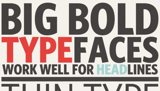
If you pick up a newspaper, you’ll notice how easy it is to just glance through a page and absorb a lot of information in a very short time. That’s because print designers have been taught how to use fonts effectively. The headlines stand out and use a font that strongly contrasts from the all-over text font. The copy is also broken up into shorter paragraphs, introduced by clearly identified subtitles.
Typography On The Web
For a long time, web design was all about the medium. It was a new, wonderful technological innovation that eventually changed how we consume information.
Now that we are past this phase and have arrived at a point where web technology is used as a tool which allows designers to really get creative, it’s our responsibility as a Bay Area web design firm to apply the best practices of typography on every site we build.
What we learned from the printed press is very valuable. There are limitations as well as exciting challenges though that we have to consider on the web.
Here at Launch Brigade, we specialize in responsive web design services to ensure our clients’ message will be perfectly readable – as well as aesthetically pleasing on all screen sizes. You can read more on this in Jacob’s blog post about mobile design.
If you would like us to take a look at your current site to see if it meets the latest web typography standards, or are wondering how to get more customers, please contact us to set up a free consultation. We’re determined to make businesses like yours more successful.
by Judith Wellner
